 HomeCountiesArticlesMethodologyContact
What CAERI Is, What It Isn’t, and How Municipal Leaders Should Actually Use It
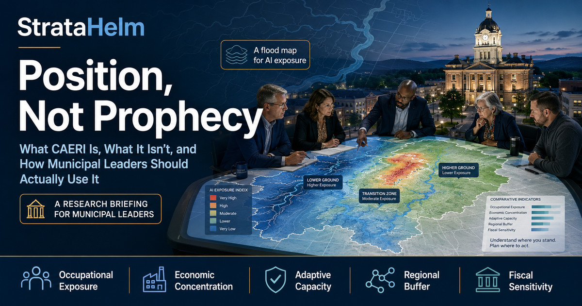
CAERI — the Community AI Exposure and Resilience Index — scores every U.S. county on two things: how concentrated its local employment is in occupations that published research links to current AI capabilities, and how well-positioned its economy is to adapt. It is built entirely from public federal data, carries a documented methodology, and attaches a confidence rating to every score. This briefing explains what the index measures, and, just as importantly, what it does not. CAERI is not a forecast. It does not predict that any job will be lost, or when. It tells a community its position, not its prophecy. The most useful way to understand it is by analogy to a tool every local leader already trusts: the flood map. A flood map does not say it will rain. It says where the water goes if it does — and no one calls that useless. Used the same way, CAERI turns a vague, paralyzing anxiety about "AI and jobs" into a concrete, comparative, planning-grade picture of where a community stands before the water rises.
Ask ten people whether AI will affect local jobs and you will get ten answers pitched at ten different levels of panic, each unfalsifiable and none actionable. The national debate, as we have written before, is conducted largely without dates or specifics attached, which makes it impossible to plan around. A mayor cannot budget against a headline. A workforce board cannot target training against a vibe. What has been missing is not another prediction — there are plenty — but a shared, neutral measurement: a way to say, in comparable terms, that this county is more exposed than that one, and this community is better cushioned than its neighbor. That is the gap CAERI is built to fill. It replaces argument with position.
This is the practical companion to the framework laid out in Mind the Clock: if that piece argues no honest statement about AI and jobs can be made without a time horizon, CAERI supplies the other missing coordinate — place. Together they let a leader ask the only questions that can actually be acted on: how exposed are we, compared to whom, and how much time and buffer do we have?
The comparison is worth taking seriously, because the parallel is close to exact. Consider how a flood map actually works, and what it is honest about.
The Federal Emergency Management Agency maps the "100-year floodplain" — the area with a 1 percent chance of flooding in any given year. Note what that map does not claim. It does not forecast a flood. As FEMA officials have stated plainly, the maps do not forecast flooding and do not predict future conditions; they identify where risk is concentrated so that communities can make better decisions about building codes, insurance, and infrastructure (Federal Emergency Management Agency; Washington Post, 2022). A flood map is a statement about vulnerability, not about weather. It tells you that if a major storm comes, here is where the water will pool and here is where it will run off. Whether the storm comes, and when, is a separate question the map never pretends to answer.
And yet no one argues the flood map is worthless because it cannot predict rain. Cities zone around it. Banks require insurance based on it. Engineers site infrastructure by it. Homeowners make hundred-thousand-dollar decisions on it. The map is trusted precisely because it stays in its lane: it maps exposure, honestly, and leaves the forecasting to the meteorologists. Its usefulness comes from being a stable, shared, comparative reference — everyone reads the same map, and the map does not change with the mood of the news cycle.
CAERI is a flood map for AI’s effect on local labor markets. It does not say the storm is coming. It says: here is where your community sits relative to the water — and here is how high your ground is.
The analogy also carries the honest caveats, which is why it is the right one. Flood maps are snapshots built on the best available data, and they have real limits — they can under-represent risk, they miss certain kinds of flooding, and a storm can exceed the modeled event, as communities outside mapped floodplains have learned the hard way (Kimley-Horn, 2025). A responsible leader treats a flood map as a serious input, not as gospel, and pairs it with local knowledge and judgment. CAERI asks to be used exactly the same way: as a rigorous, documented, comparative starting point — not as an oracle, and not as the last word.
CAERI is a composite index, which means it combines several distinct measurements into one comparative score. Each county is scored across five pillars, and understanding them is the key to reading the index correctly — because "exposure" and "resilience" are not the same thing, and the index deliberately holds both.
That last pillar is why the index speaks directly to municipal finance, and why a companion briefing, Painful Growth, dwells on the fiscal feedback loop: the sectors most likely to absorb displaced workers are often the ones a strained local budget can least afford to expand. A high exposure score paired with a high fiscal-sensitivity score is a specific, nameable risk — not a mood.
Three features of the index guard against misreading it, and each deserves a leader’s attention.
It is comparative, not absolute. Every county is scored on two bases: a national percentile — its standing among all U.S. counties — and an in-state percentile, its standing within its own state. A score is a ranking, a statement of relative position, not a probability that anything will happen. Being in the top exposure decile nationally does not mean a fixed share of jobs will vanish; it means your community sits closer to the water than 90 percent of counties. Just as a flood zone is defined by relative elevation and proximity, CAERI position is defined by relative exposure and resilience.
It carries a confidence rating. County-level occupation figures are model-based estimates built from public federal data, not a direct census of every local job. The index is transparent about this: every county carries a confidence rating, and a responsible reading weights a low-confidence score accordingly. This is the equivalent of a flood map noting where its survey data is strong and where it is approximate — an honesty that makes the tool more trustworthy, not less.
It measures position, so it pairs with judgment. The index is designed to be the beginning of a conversation, not the end of one. It tells a leader where to look and what to compare; it does not tell them what their community’s specific strengths, relationships, and plans can do about it. That part is local, and it is theirs — which is exactly where StrataHelm is building next. A set of subscription tools now in development is designed to help leaders move from position to plan: turning a county’s pillar-by-pillar standing into peer benchmarks, scenario views, and decision-ready briefings a team can act on. The index will always tell you where you stand; these tools are meant to help you decide what to do about it. The judgment stays yours. The work of assembling the evidence behind it does not have to.
Read as a position tool rather than a prophecy, CAERI supports a set of concrete moves:
Because the temptation to misuse any index is real, it is worth being explicit. CAERI is not a prediction that jobs will be lost; nothing in it projects a count of losses. It is not a timeline; it does not say when anything will happen. It is not a verdict on any community’s future — a high-exposure county with strong adaptive capacity and sound finances may navigate the transition better than a lower-exposure county that is complacent. And it is not a substitute for local knowledge, political judgment, or a plan. It is one rigorous, transparent, comparative input among the several a serious leader weighs. The flood map does not build the levee, write the zoning code, or evacuate the town. It just makes sure everyone is looking at the same honest picture of the ground before they decide what to do. That is what CAERI offers, and it is deliberately not more than that.
The value of a flood map is not diminished by its refusal to predict the weather — it is created by it. By staying honest about what it measures, the map earns the trust that lets a community act on it with confidence. CAERI is built on the same principle. It will not tell a community whether the storm of AI-driven disruption will reach its Main Street, or when. It will tell that community, in clear and comparable terms, exactly where it stands relative to the water, how high its ground is, and where its levees are thin. For leaders who would rather plan than panic, that is not a limitation. It is the entire point. Position, not prophecy — and position, it turns out, is what you can actually build on.
Every U.S. county has a CAERI position, free to look up — five pillars, two bases, a confidence rating on every score, and a fully published methodology. Find where your community stands →
Federal Emergency Management Agency. "Flood Zones" and National Flood Insurance Program materials on the 1-percent-annual-chance (100-year) floodplain. fema.gov.
Kimley-Horn (2025). "FEMA Floodplains Explained: Misconceptions and Emergency Preparedness Responses" (limits of mapped floodplains; Kerr County, Texas, July 2025). kimley-horn.com.
Washington Post (2022). "FEMA Flood Maps Fail to Show Flood Risk of More Extreme Flooding Events" (FEMA officials: "Maps do not forecast flooding… They do not predict future conditions"). washingtonpost.com.
StrataHelm. CAERI methodology, county pages, and confidence-rating documentation. stratahelm.com/methodology.html.
Companion articles: "Mind the Clock" (the time-horizon framework) and "Painful Growth" (the fiscal feedback loop). stratahelm.com/articles.